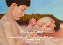
Yesterday morning I received an invitation for a solo show. The details are still in the works but the timeline looks like sometime in the spring of 2009. It’s a great opportunity and a welcome reason to get to work.
I’d like to have a whole new body of paintings to show. I don’t have the actual measurements but the space sounds like it is quite large. I’m going to need quite a few paintings. Now with a chance to show a quantity of work all at once the thought arises. Is there going to be a theme? Consistency, or at least, an evolutionary flow is needed to hold the whole show together. Thematically, I’ve been hopping all over the place for the past few years without a thought to how all the work created in that time could (or should) work together. So, where to start?
Last night I walked into my studio and decided I had to organize before anything productive can start happening. There are still remnants of printing the small woodblocks everywhere and the cumbersome coffin is filling up floor space. Where am I going to store that thing now? I haven’t had the chance (or is it courage?) to try and pull it apart so I can reprint the side panels. So it sits in the middle of the floor still in one piece.
First I set a couple of beers to chill in the window sill, cranked up some tunes and started looking for order. I moved some boxes around, put prints away, and restacked the mass of cds that multiply on any horizontal space (one of these days I’m getting me an iPod), moved and installed some shelving, and re-stacked stretchers and wood. I pulled out the stretched and gessoed 65 x 87” canvas I’ve had kicking around for a while and hung it on the wall. Finally, after some order had been restored to the space I had time to ponder what to do next while I sat and enjoyed a nearly frozen brew.
In the middle of taking a sip I happened to catch the contour of a figure appear in the play of light raking over my uneven gesso ground. Not just any figure either, I recognized this guy. He’s in one of my sketches done around the time I was working on a digital sketch for “Anhelo”. I quickly pulled some old sketchbooks off the shelf and began leafing through, all the while casting sidelong glances at the figure materializing on the “blank” canvas.
Now, I don’t normally start my work in this fashion but it has occurred from time to time. The painting “Exchange” is one of those images that just “appeared” one day as I glanced over at a blank canvas. I don’t know if I’ll end up using the idea but I figured I should at least acknowledge and follow any suggestion the universe throws at me at this point. In the end, looking through the sketchbooks for the sketch I remembered allowed me to find and reconsider about 6 old ideas from the same time period as possible compositions to work on. Not a bad start considering just a few hours before I had been racking my brain for somewhere to start.
“Salud” to the Universe. I’m strapped in. Let’s see where it goes…
Wednesday, January 23, 2008
Thursday, January 17, 2008
#7 of Top Ten: "Crossing(Loa)"
“Crossing(Loa)” 1994
Wood block relief print, 7 7/8 x 11 1/8”
Edition of 25
“Crossing(Loa)” is an example of the cross pollination that began to occur between my paintings and prints in 1994. With scraps of birch plywood from my day job I began to make prints in my Cincinnati apartment. I was without a studio, proper ventilated area or means to continue painting. I began experimenting with techniques on the wood to see how I could find an adequate means to reproduce the images I had in my head. I decided to re-examine and re-interpret a couple of painting images in print form to see how they stood up. “Crossing(Loa)”, “Almus”, and “Earthdiver” were some images that got the re-examination treatment. Some print images, like “Fire”, “Repression”, and “Whisper” eventually worked in the opposite direction and became paintings.
The painting, “Crossing (coyote)” has always been one of my favorites. That painting combined quite a few ideas I had floating through my head at the time: genetics, gender relationships, heritage and history. I remember the original idea came from the serendipitous melding of a book I was reading and a song lyric. The book was Maya Deren’s “Divine Horsemen: the Living Gods of Haiti” and the song was “Kiss of Life” by Peter Gabriel. The lightbulb went on when I realized that part of the song, like the book, was describing an important aspect of Haitian Vodou religion rites. The image that intrigued me was based on practitioners’ belief that the Loa (intermediaries of the deities) mount (possess) the ritualist and “ride” him/her as a rider rides a horse. The literal interpretation of this image intrigued me and I set about sketching different ways of presenting it. In the meantime many other associations of “crossing” began to enter my mind as I worked out the specifics of the composition. Once again the St. Christopher reference is present but the piece also playfully nods to the story of the scorpion and the frog, my cultural heritage and my family’s migration (hence “coyote”), as well as, a visual pun for x and y chromosomes.
When it came time to re-interpret the painting as a relief print I resorted to the use of cross contour lines, as in “Chasing Thoughts…”, to describe a figure. I wanted a clear distinction between the two figures in order to imply the “otherworldliness” of the Loa. The concentric flowing lines creating volume in the female figure become a nice contrast to looser sketchy lines describing the male figure. I wasn’t concerned with the mirroring of the painting’s direction that occurs in the print. This is the clear connection of having drawn the block in the same orientation as the painting and then having it print in reverse in the transfer of ink to paper.
Labels: in the studio
Loa,
Maya Deren,
Peter Gabriel,
Vodou,
woodblock relief print
Wednesday, January 16, 2008
#8 of Top Ten: "Ringcrow"
“Ringcrow” 2007
3 x 4” chiaroscuro relief print
5 variable editions of 5
Crows and ravens have always fascinated me. I love their black shapes cutting across the sky, their raucous calls, their mystique and their intelligence. I know many people that think that crows are evil or dangerous. I like that they serve as instigators and clever tricksters in Native American myths, companions of Odin in Norse myths and land finders in the Epic of Gilgamesh.
These black birds have always brought a smile to my face no matter where I may be. When I lived in Cincinnati a murder of crows would arrive by the hundreds (maybe thousands)to roost in the trees of Mount Adams. Their pops, gurgles and snapping language would greet me in the morning as I went to work at the Art Museum and again at night as I left for home. I have to wonder if the famous Rookwood Pottery studio just up the road took it’s name from the annual arrival of these magnificent birds.
“Ringcrow” is a simple ode to those pursuers of shiny things. In this case the little thief has captured someone’s ring. A wedding band perhaps?
The prints in this particular series entitled “Unfinished Stories” were my first attempts at multi-block multi-color relief prints. The color editions are small, just 5 (sometimes 6) prints per color with a total of 5 color runs per print. I like the way a different color will change the mood of the image even if ever so slightly.
Labels: in the studio
chiaroscuro,
crow,
relief prints,
ring
Tuesday, January 15, 2008
#9 of Top 10: "Lotus"
“Lotus”, 2000
Serigraph
12 7/8” x 8 3/4”
Edition of 20
Lotus is another image that kicked around for a long time before it found the proper medium to present it. I love the metaphor of the lotus- a plant that lives in three worlds (mud/water/air) and represents the four elements (earth, water, air and fire (sun)). I’m interested in the flower as a metaphor for the awakening of consciousness. I had attempted a painting of the same image back in 1992 but didn’t feel that it conveyed the feeling I was going for. I was always hoping to give it another go at some point.
In the winter of 1999 I was introduced to Malaquias Montoya (http://www.malaquiasmontoya.com). Malaquias is an artist of great conviction, as well as, a font of information on screen printing (or serigraphy) and the Chicano art movement. The University of Notre Dame had invited Malaquias as a visiting professor to teach screen printing for a semester. I couldn’t pass up the opportunity to learn from a master so I arranged my work schedule to attend his morning class.
Serigraphy turned out to be the missing link I had searched for between painting and color printmaking. Malaquias’ instruction helped me bridge the gap between the two mediums by showing me that you could be as tight or as loose as you wanted to be when making images with the screen. I loved the immediacy that the water borne inks allowed when layering colors.
When it came time to work on some images I pulled out some old sketches as reference for something new. I thought I would revisit the lotus idea and try one last time to get it right.
I used one screen and a stop out method to paint out the various layers of color. Using this method I first chose what was going to remain white on the page and blocked that out with some screen filler and ran a light yellow tint. Next, I chose what areas of the yellow were going to remain blocked them out and printed the next color. This process continued – light to dark and always on the same screen. I would block out more and more with a brush to give it a loose painting feel and to limit where the next color would lay. I worked on this most of the day and into the evening. I remember Malaquias coming in the next morning and asking how many colors I had pulled. I told him I had lost count after 18 and he laughed in amazement (at my tenaciousness, I think). I couldn’t help myself. Every time I put down another tone I would see where I could push the area some more. I finally had to stop when the stop-out I had used started to break down. The only other screen I used was for a tonal overlay on the figure to give him a little more definition.
Malaquias Montoya was, and continues to be, an inspiration to me - not only as an artist but as a person. He’s constantly working and is a prolific artist. During the class he could always be found in the lab working on his own prints but willing to help someone out with technical questions whenever possible. It was an enlightening experience to see this man work and encourage the students in the class. Our friendship has continued since that class and I always look forward to see what new work he is doing.
Some of the prints that I created during the semester I attended his class were: Lotus, Dowser Drowse, Corazon, Bendicion and Tamaleros.
Labels: in the studio
lotus,
Malaquias Montoya,
Serigraph,
University of Notre Dame
Friday, January 11, 2008
"Anhelo" Part II or Anatomy of a Print...
In March of 2004 I had the honor of being one of the 18 artists selected to be part of the 11th Serie Project at Coronado Studio in Austin, Texas. The week of Monday March 15 – Saturday the 20th was spent printing the print “Anhelo”. I traveled to Austin with anticipation of working on a new print in a new environment and among new acquaintances. I took along some tunes, a digitally drawn color image, a to-scale printout of my idea as reference for creating the print and an open mind. I worked with master printer, Satch Grimley. Satch was great at intuiting what I had in mind and worked with great dedication mixing and pulling colors for the print. I also had in mind catching a few performances at the yearly South by Southwest music festival.
Monday Satch cut down paper, set registrations and prepared screens while I did some ebony pencil tone drawing on textured mylar. We decided four basic color break-outs were needed for a good base to start from so I did a lot of drawing the first two days.
Tuesday Satch and Coronado intern, Dominic Pagalilanan, started pulling transparent layers of background colors. They layered the four basic colors as I worked up the mylar drawings for transfer onto the separate screens. We strayed from the original print idea by creating a border effect around the main image (which ended up putting us a couple of inches over the Serie Project’s maximum image size standard.)
Wednesday printing continued. More transparent layers were laid down bringing more definition to the figure and background areas. I worked into some of the drawings on mylar with India ink and used these to shoot new screens. The ink made a stronger contrast in blocking out the screen and helped get more concentrated areas of color. Wednesday night Satch and I caught some of the SXSW shows in downtown Austin. The standout performances were by the Futureheads and Destroyer.
Thursday we continue to define areas with more transparent layers. I am suddenly aware that time is short. Satch and I both conclude that doing the ebony drawing on mylar took up more valuable time than necessary so we have to make that up somehow. My flight out is early Sunday morning and the prints need to be done before then. Thursday night Dominic and I head downtown to catch some more of the SXSW. I met up with one of my old Art Academy student turned rockstar, Patrick Keeler (from The Greenhornes and now The Raconteurs.)
Friday we put in the longest day ever. Satch amazes me by pulling many colors this day. Around 1:00 a.m. (Saturday) we called it quits as we were both wiped out and starting to lose focus. I liked where we were but I could see the image needed to be pushed and pulled in a few areas to really make it work. I was worried because Satch had prior commitments of his own at Flatstock and I didn’t know if the print would be finished to my satisfaction. During the day my old high school buddy McCleod shows up but I'm too far behind and busy to really get a chance to talk to him. We plan a time to meet later that night but printing late causes me to miss that meeting.
Saturday morning Sam comes in and we talk over the status of the print. Sam agreed that the print needed a few more steps. He made a call to Marie, the wonder woman. While Sam and Marie shot more screens, mixed more colors and pulled more layers I blocked out more templates. Late in the evening I got into pulling some colors myself. We worked the whole day until 10:00 p.m. or so. Finally we got to where I was satisfied with the print. But we still weren’t done. Our next steps included selecting the prints for the edition, signing them all and adding the Coronado chop mark.
Over all this was a great experience for me. A whole week in total working environment is really a luxury for me at this point of my career. I’d like to thank Sam Coronado and all the staff at the studio for being so generous and kind towards me while we produced this print: Satch Grimley, Marie Garza, Leah Hesla, Dana McBride and Dominic Pagalilanan. I would also like to thank Gilberto Cardenas and Notre Dame University’s Latino Studies for sponsoring my trip to and from Austin and making this endeavor possible. A special thanks goes to Marie Garza for photographing the process.
Labels: in the studio
Anhelo,
Austin,
Coronado Studio,
Patrick Keeler,
Sam Corodado,
Serie Project,
SXSW
Thursday, January 10, 2008
#10 of Top 10: "Anhelo" (part I)
“Anhelo”
2004, 26 x 16”, serigraph print
edition 65
Printed at Coronado Studio, Austin, TX
“Anhelo” is one of those images that had a long gestation period and continues to haunt me. To date I have made three versions of this image (a digital painting in photoshop, a charcoal drawing, and a serigraph print.) I think the initial idea came to me back in 1993 when I was creating my underwater series, but it wasn’t until much later that I actually committed a sketch to paper (a doodle really, in the margins of one of my work calendars during a staff meeting). The plunge was the basic aspect I wanted to represent. Cannonball, bubbles billowing overhead, a bubble tornado – a disturbance in the calm.
Later, the idea grew. I wanted there to be a purpose to the plunge some action that would pose a bigger question. The figure began to hold onto something. The thing was either going to help or hinder him. In the end the “thing” grew to represent that which one holds onto, stubbornly, far past the point where it’s good for you. Will you let it go – or will you let it drag you down?
The title is the bow on the package. Anhelo is the Spanish word for desire or longing.
Labels: in the studio
Anhelo,
Austin,
Coronado Studio,
longing,
Serigraph
Friday, January 4, 2008
#11 of Top Ten: "Chris Cross"
“Chris Cross”
2005, 11 x 11” wood block relief print
edition of 25
This print was created along with three others for an exhibit at The Moreau Gallery at Saint Mary’s University in 2005. The four were part of a small series based on my hopes, dreams, fears and wishes for my two small sons. The other three prints are: “Bendicion”, “Trenza (self portrait)” and “TV (fear).”
“Chris Cross” represents my concern over the contamination and destruction of our environment as it relates to future generations. There’s nothing too subtle about the image – there’s the polluted water, the deforested landscape and in the background a billowing cloud from nuclear reactors. When the idea first came to me I knew I wanted a person crossing a river. The crossing theme is one I’ve come back to more than once in my work (see “Memoria”, “Umbral”, and “Crossing (coyote)” as examples). What I wanted to do was contrast the idea with some mythic references to give it some depth. One day while I was driving around the idea flashed on how I could accomplish this. St. Christopher would be crossing the river.
I’ve always liked the Christopher legend. (I won’t give you the whole thing you can Wikipedia it.) I liked the giant and child aspect, the weight of the world in the Christ child’s person, the pun name (Christos = Christ, pherein = bear across …Christ carrier). I thought that it would be interesting to see Christopher try to ferry JC across a filthy polluted river. Even with his rubber waders the giant has paid a toll as evidenced by his lesion pocked skin. It can’t all be grim though. Just like in the legend there is the hope that the giant’s staff will flower again.
A couple of nods are given to two of my favorite artists, Edvard Munch and Dr. Seuss. I’m sure you’ll have no trouble picking those out.
Labels: in the studio
Dr. Seuss,
Edvard Munch,
Moreau Art Gallery,
Saint Mary's University,
St. Christopher
Thursday, January 3, 2008
"There are places I remember..."
2008, January 2
I spent most of my time off from work traveling and visiting people. First up to the U.P. (Upper Peninsula of Michigan Eh!) for Christmas and then to West MI to visit my family and some friends. I wasn’t able to get to everyone I wanted to see. By the end of all the traveling (with two rambunctious boys), eating and sleeping in other people’s houses, and overloads of both good and bad food (sometimes it’s hard being a veggie in a carnivorous world)…I was glad to be home. And I thought I was going to get some studio time somewhere in there…riiiiiiight.
One very cool thing I did was visit with my longtime friend, Sue. Sue and I go way back. She was not only my middle school art teacher she was also my art teacher for the last two years of high school. What cemented our friendship was a mutual love for all things Beatles (and art of course!) Sue has been one of the influential persons in my life that kept me on the art-making track through the weird teenage years and beyond.
A bonus to meeting up with Sue again was seeing and spending time in her Beatles shrine (my description). She and her late husband have been big collectors of Beatles music and memorabilia since they were quite young. Sue has been busy over the last months since her retirement organizing the huge collection. I could spend days in that room – hundreds of books, buttons, figurines, pictures, and music! Along with her own Beatles inspired artwork there’s hundreds of vinyl records, cds, tapes, you name it – a Beatlemaniac’s delite.
I loved to draw and I loved Beatles music before my 11-year old self ever walked into her classroom but Sue’s enthusiasm, passion, and encouragement were contagious forces that led me to pursue an art career. Thanks Sue.
Subscribe to:
Posts (Atom)