Showing posts with label relief prints. Show all posts
Monday, January 16, 2012
Caritas: The Immigrant in the Word print series
The paper I proposed for Inter-University Program for Latino Research’s conference, SIGLO XXI: Forging the Future of Latinos in a Time of Crisis, was accepted. I will be flying to NYC to present on a panel which will take place at John Jay College of Criminal Justice, CUNY in New York on February 23rd. My fellow panelists will be:
Henry Rivera, Arizona State Senate Bill 1070
Daniel Eduardo Martinez & Jeremy Slack, The Migrant Border Crossing Study: New Evidence of the Unauthorized Crossing Experience through the Arizona-Sonora Border
My paper is entitled “Caritas: The Immigrant in the Word” which is the title I gave to the latest series of relief prints. The print series combines passages from books of the Bible with images of contemporary immigrant issues such as rights abuses due to legislation.
This 6 print series began with a print I created for the Consejo Grafico’s portfolio entitled “Borrando la Raya/Erasing the Line”. The portfolio consisted of images dealing with immigration issues. My contribution was a 9 x 13” color linoleum block print entitled “Fallecio el SeƱor Urbano Ramirez” (Mr. Urbano Ramirez died).
The idea for the image came about after I heard Mr. Baldemar Velazquez, President of Farm Labor Organizing Committee (FLOC) speak in 2009 at an award ceremony honoring my father, Maximino Rodriguez, with the Cesar Chavez Tri-Community Award. Mr. Velazquez told the shocking but now all to common story of farmworker, Urbano Ramirez Miranda, who died in a field in North Carolina and was not found until 10 days later. Undocumented = cheap & expendable labor.
Within his talk Mr. Velazquez, an ordained chaplain, spoke of his search through the bible for passages that deal with the treatment of the alien/immigrant among other people. He found three passages that spoke to this subject - Exodus 22:21, Numbers 15:15, and the one of which I chose to use as a footer to the image. The passage is from Leviticus 19:34 “The alien living with you must be treated as one of your native born.” The print and quotes inspired me to create prints marrying the remaining passages with powerful images to make an impact on those that profess charity through their religion yet ignore the written word’s suggestions.
I have expanded on the three passages with a few more for a total of six passages and images.
Labels: in the studio
Baldemar Velasquez,
Caritas,
CUNY,
Daniel Eduardo Martinez,
FLOC,
Henry Rivera,
Immigration,
IUPLR,
Jeremy Slack,
John Jay College of Criminal Justice,
Ramiro Rodriguez,
relief prints,
Siglo XXI
Friday, September 2, 2011
Navigating the Currents
I volunteered to make a print for Inkteraction’s Navigating the Currents: 100 Inkteraction Reactions portfolio.
My idea is pretty simple: a printmaker carrying a heavy roller through a binary marsh of 1s and 0s.
This print's requirements were for a smaller 5x7” sheet of paper so the image is pretty small. I chose to further explore color reduction relief printing with my snazzy new registration system. This time I went for a cooler palette than the previous two prints.
(1st & 2nd color layers)
I don't know if it is the changes in humidity or my new block prep that have affected ink layering in a positive manner. In prepping to ink up this block I scraped down the linoleum with the side of a razor. The “La Vida Dulce II” print had some inconsistent ink layers due to what I think was the factory texture of the lino block. Each successive layer of ink picked up on the texture of the layer below and compounded the “orange peel” texture where I had intended flat areas. Of course I rolled with it and used the texture to some advantage but I wanted to avoid this in the future. I believe the shaving/planing of the block prior to inking led to a more even and flat layer of ink.
Four layers of blue were laid down to create the print. I debated adding a finishing black line layer. In the end I like the all blue palette.
Labels: in the studio
Inkteraction,
Ramiro Rodriguez,
reduction print,
relief prints
Wednesday, August 24, 2011
La Vida Dulce take 2
I ordered a new registration system and decided to take another stab at the reduction print at the correct size. I restructured the drawing a bit from the first smaller print.
First color proof, second color block and proof:
The over lay of second color on first:
The third color proof, third color block and third color overlay:
The reduced fourth color block and printed overlay:
The fourth color overlay, fifth color block (now greatly reduced) and the final 5th color overlay:
Finished prints hung to dry:
For comparison, La Vida Dulce I (3 colors) and La Vida Dulce II (five colors).
Labels: in the studio
Calaca,
reduction print,
relief prints
Tuesday, July 26, 2011
Reduction print (pt.2)
I decided to continue printing the reduction print on the wrong size paper. I'll just have to do another one on the right size paper later. Here is the second color run.

Here is the first color state, second color state and the second color on it's own for comparison.

Here is the third and maybe last color run and the block much reduced.


Here is the first color state, second color state and the second color on it's own for comparison.

Here is the third and maybe last color run and the block much reduced.


Labels: in the studio
Ramiro Rodriguez,
reduction print,
relief prints
Friday, July 22, 2011
Reduction print
I’ve got a few pans in the fire.
One: I’ve agreed to make a print for the Inkteraction print exchange with the theme “Navigating Currents: 100 Inkteraction Reactions” due at the end of September. Two: I’ve also been asked by Carlos Barberena and Calaca Press to contribute a print to the “Calacas” themed International Print Exchange. Three: I have a few possible commissions I need to think about.

I’ve decided to try my hand at a reduction relief print for at least one of these portfolio exchanges. I haven’t attempted a reduction print since I was 15 years old and made a 4 color print of Freddie Mercury for my high school art class.
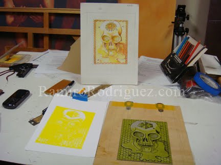
A reduction print is a multi-colored print that is created using one block. Each color is printed in sequentially, usually light to dark. You can start by printing the whole block as a base tone for the print or remove some of the block before inking thereby leaving some of the paper exposed as a base or highlight. Before the second run of color more of the block is removed ("reducing" the block)which leaves some of the first color printed (and paper) exposed wherever the block has now been cut away. This process is repeated until the final color state, sometimes a black but not necessarily so, is printed. The block is destroyed in the process, therefore it is not possible to go back a step and re-do a state. Obviously a little pre-planning and a good registration system is in order for a successful print.


The idea for the Calaca theme came quickly – a variation of something I’ve wanted to do for a while now. First I drew a color sketch then I transferred the image to a block. Next I decided what areas were going to be left white (the color of my paper) and cut those areas away. Next I printed the yellow base color… Then I realized I had used the wrong size paper to print this edition….!!!! (to be continued)

One: I’ve agreed to make a print for the Inkteraction print exchange with the theme “Navigating Currents: 100 Inkteraction Reactions” due at the end of September. Two: I’ve also been asked by Carlos Barberena and Calaca Press to contribute a print to the “Calacas” themed International Print Exchange. Three: I have a few possible commissions I need to think about.

I’ve decided to try my hand at a reduction relief print for at least one of these portfolio exchanges. I haven’t attempted a reduction print since I was 15 years old and made a 4 color print of Freddie Mercury for my high school art class.
A reduction print is a multi-colored print that is created using one block. Each color is printed in sequentially, usually light to dark. You can start by printing the whole block as a base tone for the print or remove some of the block before inking thereby leaving some of the paper exposed as a base or highlight. Before the second run of color more of the block is removed ("reducing" the block)which leaves some of the first color printed (and paper) exposed wherever the block has now been cut away. This process is repeated until the final color state, sometimes a black but not necessarily so, is printed. The block is destroyed in the process, therefore it is not possible to go back a step and re-do a state. Obviously a little pre-planning and a good registration system is in order for a successful print.


The idea for the Calaca theme came quickly – a variation of something I’ve wanted to do for a while now. First I drew a color sketch then I transferred the image to a block. Next I decided what areas were going to be left white (the color of my paper) and cut those areas away. Next I printed the yellow base color… Then I realized I had used the wrong size paper to print this edition….!!!! (to be continued)

Labels: in the studio
Calaca,
Carlos Barberena,
Inkteraction,
Ramiro Rodriguez,
reduction print,
relief prints
Wednesday, May 11, 2011
Late night
Feliz 82 'Apa.
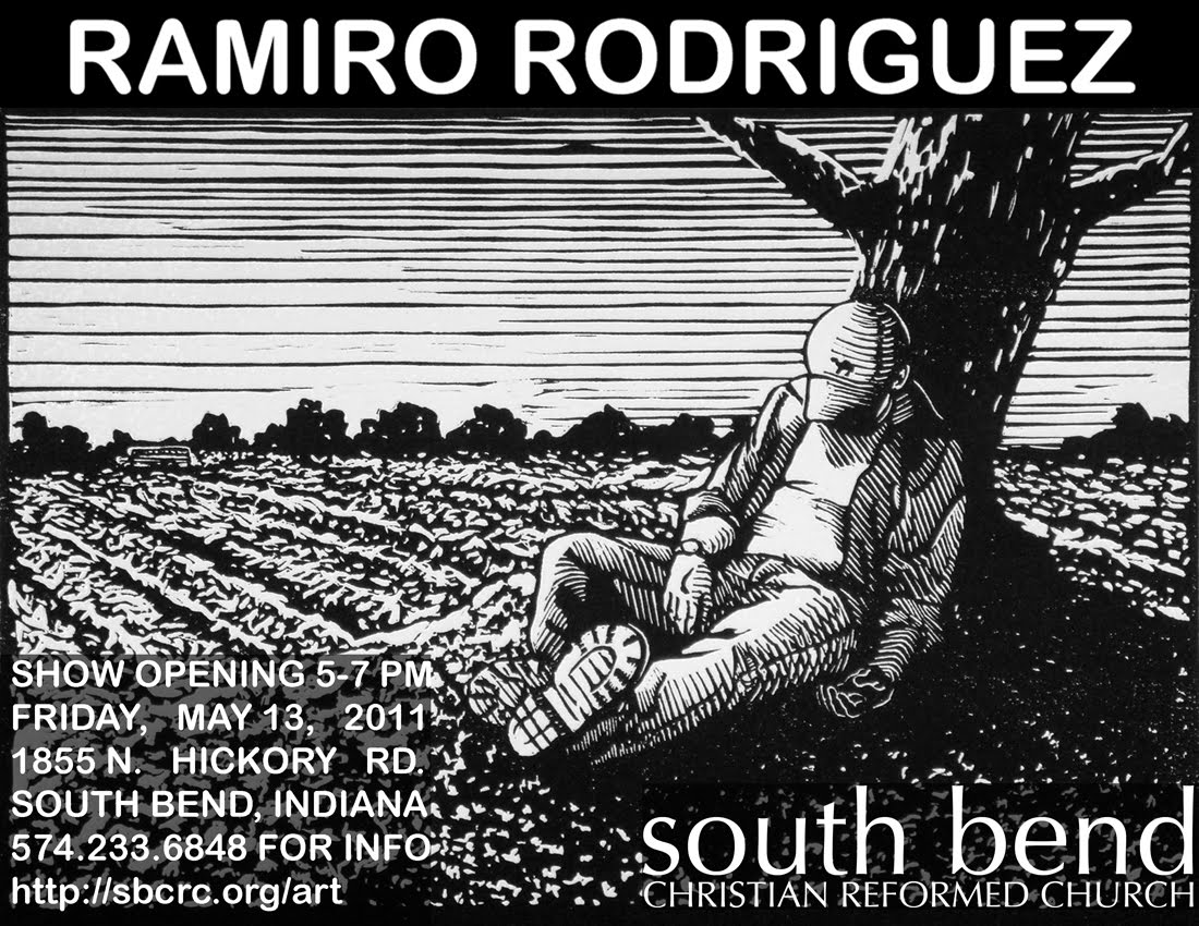
The exhibit at South Bend Christian Reformed Church opens this Friday. I’ve been putting in long days and late nights lately. It always seems to come to this right before an exhibit. Always just a few more prints or finishing touches needing to be taken care of. Selecting prints that are appropriate with this venue has gotten me thinking. Re-conceptualizing a varied group of works into a compatible whole is always good. I also took this opportunity to actualize an idea for prints that has been brewing for a while. The church function of this particular exhibition venue made me want to bring the images forth to see how they do.
The show still hasn’t been laid out (in fact I just finished printing this morning and am due to help my wife frame up the remaining pieces tonight) but I have an idea of how the work will be broken up into four sections. Each section bleeds into the others at times but they’ll go something like this - section one: the family relationship prints; section two: the dreamscape prints (hopes/fears); section three: the world-view (The inkling for this series was ignited at a reception for my father.); section four: nature. We’ll see how this plan holds up when installation time rolls around.
Late nights at the studio always mean something else has to be left undone or for someone else to take care of. I’m grateful to my best friend and supporter – my wife, Laurie, for all she does everyday and especially when exhibit time rolls around. Te amo.
Tuesday, May 3, 2011
Sunday, October 24, 2010
Dirty Printmaking
Wednesday I finished printing up my newest woodblock relief print for the Dirty Printmakers of America’s “State of the States” portfolio. The new print is titled “Toma, Tomas.”
Labels: in the studio
Dirty Printmakers of America,
relief prints,
State of the States
Wednesday, September 29, 2010
The dragon, the tree and the wall
Another patron has purchased a suite of the Earth Dragon prints. This is the suite of prints pulled from the coffin I created for my installation "Cuentos y Memoria" in 2007.
This print has become a bit of a challenge to frame and exhibit because of it’s 18” x 16’ length. The solution has been to frame up the prints in 4 sections - the three “head” portions of the print in one frame, the two 54” long side prints and the “tree of life/tail” sections separately.
While working out framing logistics and placement options the couple asked if I would be interested in painting some elements from the print designs onto a stairway wall in their home somewhat like what I did in Omaha last year. Here is what the wall looks like after two nights of working on it. The white rectangles are where the framed prints will be hanging.
This print has become a bit of a challenge to frame and exhibit because of it’s 18” x 16’ length. The solution has been to frame up the prints in 4 sections - the three “head” portions of the print in one frame, the two 54” long side prints and the “tree of life/tail” sections separately.
While working out framing logistics and placement options the couple asked if I would be interested in painting some elements from the print designs onto a stairway wall in their home somewhat like what I did in Omaha last year. Here is what the wall looks like after two nights of working on it. The white rectangles are where the framed prints will be hanging.
Labels: in the studio
Dia de los Muertos,
Earth Dragon,
Ramiro Rodriguez,
relief prints
Tuesday, October 27, 2009
More winter exhibitions
I have a couple of exhibitions happening this winter in South Bend, Indiana, USA. Follow the links for place, date and maps.
Oscura: Prints, Drawings and Paintings by Ramiro Rodriguez @ the South Bend Civic Theater Community Gallery. October - December 2009.
Materia Prima: Recent Paintings and Prints by Ramiro Rodriguez @ the Crossroads Gallery in downtown South Bend. November 30, 2009 - January 29, 2010
Oscura: Prints, Drawings and Paintings by Ramiro Rodriguez @ the South Bend Civic Theater Community Gallery. October - December 2009.

Materia Prima: Recent Paintings and Prints by Ramiro Rodriguez @ the Crossroads Gallery in downtown South Bend. November 30, 2009 - January 29, 2010
Labels: in the studio
drawings,
Fine Art,
Materia Prima,
Oscura,
paintings,
Ramiro Rodriguez,
relief prints
Friday, March 7, 2008
"Touch Down" for Caduceus.org


“Touch Down”
2007, chiaroscuro wood block relief print
4” x 3”
limited edition of 5 prints
5 variable colors
My friend Maynard James Keenan has chosen to use the image of my print “Touch Down” as a t-shirt design for his vineyard, Caduceus. The shirts are available at his Puscifer.com web-store (look under “Drones Limited Run”). The prints from which the image is taken are available for sale from my website: RamiroRodriguez.com.
The image is from one of those oddball doodles created during some staff meeting. The image didn’t seem to have a place in any series until I decided to do the small color relief prints just for those types to get a home. It’s a pretty simple idea, playing on a mishmash of two mythic Greek characters Hermes and Achilles. You can see where my head is really at during a staff meeting when my idea of a joke is: A god coming in for a landing on earth and pricking himself on a tack.
Labels: in the studio
Achilles,
Caduceus,
Hermes,
Maynard James Keenan,
Puscifer,
relief prints
Tuesday, February 19, 2008
5 and 6 of Top Ten

“Spacetime” 1994
wood block relief print
8 9/16 x 11 5/8”
Edition of 25
I remember reading Leonard Shlain’s “Art and Physics – Parallel Visions In Space, Time and Light” at the time that the sketch for “Spacetime” came about. I would read while doing guard duty at the CAC or while sitting nights at the Cove CafĆ© where a beautiful curly haired brunette pulled the late shift. I’d listen to the eclectic music selection while drinking coffee, beer or cocktails with the other patrons and secretly wished we were all time tripping back to Paris in the 20s. The initial sketch is scratched out on the back of a blank check lifted from the shop’s pad.
The initial idea was to present an image that would combine the ideas of particles and waves in the stream of time. This was when I was working on my underwater figures series and I think the element worked nicely with the “flow of time”. The male figure’s stance is an “as above, so below” pose. The ripples he creates on the water’s surface influence/echo the circle he’s drawing on the undulating sand.
I like the element of water as a compositional device because it can imply something working beyond the picture plane. Just as in the print “Lotus” there are various levels or worlds working simultaneously. The water current has shaped the sandy landscape, the tides along with the wind above have influenced the current and the sun far above it all casts it’s influence. The man tries to make sense of it…all in good time.

“Repression” 1994
wood block relief print
8 3/8 x 11 3/4”
Edition of 25
“Repression” presents the anima manifesting herself to the surprise of the unsuspecting repressor. What exactly the male figure is holding under water is the little mystery I like to pose wherever I can in my work.
I had been reading many of Carl Gustav Jung’s collected works, Camille Paglia’s “Sexual Personae: Art and Decadence from Nefertiti to Emily Dickinson” and various studies on goddess culture. The combination of similar ideas led to this image.
I am particularly proud of the way the cross contour lines create a chevron, an attribute of the Goddess, on the female figure’s torso and the way the background flattens into a screen of sorts.
“Repression” evolved and was later re-worked into the painting “Call”. In the painting the figure emerging from the background is motioning in what Joseph Campbell called the “fear not/boon bestowing” gesture.
Labels: in the studio
C.G. Jung,
Camille Paglia,
Joseph Campbell,
Leonard Shlain,
relief prints
Wednesday, January 16, 2008
#8 of Top Ten: "Ringcrow"

“Ringcrow” 2007
3 x 4” chiaroscuro relief print
5 variable editions of 5
Crows and ravens have always fascinated me. I love their black shapes cutting across the sky, their raucous calls, their mystique and their intelligence. I know many people that think that crows are evil or dangerous. I like that they serve as instigators and clever tricksters in Native American myths, companions of Odin in Norse myths and land finders in the Epic of Gilgamesh.
These black birds have always brought a smile to my face no matter where I may be. When I lived in Cincinnati a murder of crows would arrive by the hundreds (maybe thousands)to roost in the trees of Mount Adams. Their pops, gurgles and snapping language would greet me in the morning as I went to work at the Art Museum and again at night as I left for home. I have to wonder if the famous Rookwood Pottery studio just up the road took it’s name from the annual arrival of these magnificent birds.
“Ringcrow” is a simple ode to those pursuers of shiny things. In this case the little thief has captured someone’s ring. A wedding band perhaps?
The prints in this particular series entitled “Unfinished Stories” were my first attempts at multi-block multi-color relief prints. The color editions are small, just 5 (sometimes 6) prints per color with a total of 5 color runs per print. I like the way a different color will change the mood of the image even if ever so slightly.
Labels: in the studio
chiaroscuro,
crow,
relief prints,
ring
Tuesday, December 11, 2007
#12 of the TOP TEN:

I tallied up the votes from my myspace friends and had a tie in the last four prints people wanted to know about. So, instead of a "Top 10" you'll get a "Top 12". I'll begin with number 12:
“Chasing Thoughts…”, 1993, woodblock relief print, 11 1/8 x 7 7/8”
In the winter of 1993 I had just completed graduate school, had no studio to paint in, and little money to my name. At Christmas time I wanted to make something for my family in lieu of having to buy presents. I had scrap wood I’d salvaged from the arts center I worked at so I decided to make a relief print that I could print by hand in my apartment. My first attempt was “Volador” which I loved, however, it’s 18 x 24” size was way too much work to print by hand in time for that particular Christmas. “Chasing Thoughts…” was the second and smaller attempt.
The idea for making prints instead of painting meant a change in my method of working. I wanted the prints to be radically different in process from my standard way of working. I didn’t want to spend many hours and days making studies and references for life like accuracy. I wanted the pieces to be immediate and not necessarily true to life in subject matter and presentation. I wanted to go with an initial impulse with little editing. I also chose to work from memory in describing the figures and environments. Dreams, memories and out of context ideas left in sketchbooks were to be the source for images.
The initial idea for “Chasing Thoughts…” came from a dream I had in which a guru-like man was talking to a group of people on the second floor of an apartment house. He sat cross-legged, with his back to a wall, while many people sat in front facing him. As he spoke to those gathered around I was stuck outside on the balcony peering in through the sliding glass doors. An old friend came up the stairs intending to sit in but we began to talk and catch up instead. In the end, we both missed the discussion.
The rest of the dream unfolded in a dramatic way until I awoke. The rest of the day I carried on at my job but couldn’t shake the persistent memory of the dream and a feeling that I had missed out on some really important message being transmitted by the guru-man. At some point during the day a song came on the player that suddenly locked together with the dream residue and formed an immediate image in my head. The song was “Secret Journey” by the Police. The whole song resonated with my feelings associated with the dream but the line that got me was:
“…And on the days that followed
I listened to his words
I strained to understand him
I chased his thoughts like birds…”
Most images I work out take hard effort to come up with, but every once in a while an image presents itself in an almost fully realized way. This image was one of the latter. I envisioned a literal interpretation of the song lyric, saw the figures, saw the birds emerging from someone’s head and I saw the vantage point. I made a quick notation in my sketchbook so as not to forget it and waited anxiously to get home in order to work it out on the block.
Once home I drew out the image on a block in pencil and prepared to carve. At once, the problem arose as to how to represent the figures as volumetric forms with only line to work with. For the longest time I had been working predominately in paint where I could blend and glaze to create volume. Representational relief printing had always seemed so flat and boring to me when I studied in school, which is one of the reasons I avoided it. I recalled my love of M.C. Escher prints and how he used contour line to magnificently describe objects. I knew this was the way to go for me as well. I would use the weight of line and cross contour to give me the volume, dimension, and patterning that I sought. I also included stipple marks as a contrast to all the linear and planar forms. I love to play at contrasts for a fuller range of possibilities: black and white, curve and straight line, flat and volume, chaos and order, movement and calm, etc.
The bird’s eye view composition is based on a spiral superimposed on an intersecting diagonal structure. My intention was to keep the viewer’s eye in constant motion from one side of the picture plane to another and from the outside to the “bird in hand” and back out again.
I am really pleased with the result and my family was too. Initially I printed up 25 prints for my family on a tableau paper. I later printed up a second edition of 25 on Sumi paper that I have available for sale on my website: RamiroRodriguez.com.
Labels: in the studio
dreams,
Ramiro Rodriguez,
relief prints,
Secret Journey,
the Police
Wednesday, December 5, 2007
Prints and Sides
Last night in the studio I printed out 6 more sets of the 3x4" prints while watching the snow quickly accumulate outside. I made various variations of a violet color to use on "Air", "Bubble", "Annunciation", "Sh!tbag" and "Nullify".
All the while listening to my freshly received "Side Four Live" by Adrian Belew
This cd rocks!
First impressions:
Adrian Belew (and the Power Trio)
Side Four (Live)
Ade’s powerhouse trio kicks off with a frenetic yet tasty “Writing on the Wall” that is solidly grounded by Julie Slick’s bottom end. Makes me wonder if this is why the young woman wears no shoes on stage – perhaps to keep Adrian and her brother Eric’s fast paced chops from sailing off through the roof.
An old Crimson favorite from THRAK, “Dinosaur” comes next. The composition gets some new twists from the Trio, mainly substituting the synth guitar break for some signature Belew dino blasts. The Power Trio does the Double Trio proud.
The main groove of “Ampersand” gets more of an ebb and flow feel than the previous “Sides” cd versions. The drumming is not as busy yet still powerful with the right amount of finesse.
“Young Lions” has all the galloping jungle rhythm of the cd version. An added, almost bolero-esque, break provides the base for some crazy Belew guitar pyrotechnics.
Eric leads off “Beat Box Guitar” with some fine high-hat sticking. The trio has really expanded this gem into a highlight jam platform. The talented Slick rhythm section really holds it down while Adrian works over the top with an assorted bag of guitar sounds that are pure Belew. However this isn’t just a showcase for Ade, the three musicians really lock in with some great interplay and even drop in a “Discipline” nod.
Adrian’s layered backwards guitar sound on “Matchless Man” is one of the most strangely beautiful effects I’ve ever heard.
Eric and Julie lay down the ominous grounding groove to one of the harder songs for me to listen to on cd - “A Little Madness.” It’s difficult listening for sure. Live, however, this beast builds with the layered architecture of maddening looped Belew wailings. The live experience feel is excellently captured on Side Four and this track is the proof of the quality engineering and mastering done by John Sinks and John Zonana respectively.
The hypnotic, “Drive,” allows an intermission of sorts as the Slicks take a breather. Adrian accompanies himself via rhythms built from loops. My very favorite part in this solo piece speaks to my inner Beatlemaniac - the “Within You Without You” reference. Wow!
The Slicks rejoin Ade for a rollicking “Of Bow and Drum” complete with ghost harmony vocals by Biff Blumfumgagne. I’ve always loved the pinched squeal of the guitar on this piece but it’s Belew’s attention to contrast in texture that really makes it for me. Julie and Eric’s groove at the end is a treat as well.
The re-vamped, big drum sound of “Big Electric Cat” made me think I was going to hear “Gun Man” for the first few beats. The update polishes up this older favorite.
Two classic 80’s Crimson songs played as encores during the tour close out the cd. “Three of a Perfect Pair” is probably my favorite KC tune and watching/hearing Adrian playing his and Robert’s parts while singing in odd time is amazing. Julie’s playing and rich sound should make Tony smile. A short nod in the “Frame by Frame” direction is fun to hear as well.
A run through “Thela Hun Ginjeet” makes for the perfect leave-them-wanting-more ending to a great set and cd. Adrian is always a pleasure to experience live. I’ve seen him many times over the years with Crimson, the Bears and solo. Every time I’ve seen him play he always looks like he’s having the time of his life on stage. It’s nice to hear a recording that captures that sense of satisfaction. Time to hit repeat.
All the while listening to my freshly received "Side Four Live" by Adrian Belew
This cd rocks!
First impressions:
Adrian Belew (and the Power Trio)
Side Four (Live)
Ade’s powerhouse trio kicks off with a frenetic yet tasty “Writing on the Wall” that is solidly grounded by Julie Slick’s bottom end. Makes me wonder if this is why the young woman wears no shoes on stage – perhaps to keep Adrian and her brother Eric’s fast paced chops from sailing off through the roof.
An old Crimson favorite from THRAK, “Dinosaur” comes next. The composition gets some new twists from the Trio, mainly substituting the synth guitar break for some signature Belew dino blasts. The Power Trio does the Double Trio proud.
The main groove of “Ampersand” gets more of an ebb and flow feel than the previous “Sides” cd versions. The drumming is not as busy yet still powerful with the right amount of finesse.
“Young Lions” has all the galloping jungle rhythm of the cd version. An added, almost bolero-esque, break provides the base for some crazy Belew guitar pyrotechnics.
Eric leads off “Beat Box Guitar” with some fine high-hat sticking. The trio has really expanded this gem into a highlight jam platform. The talented Slick rhythm section really holds it down while Adrian works over the top with an assorted bag of guitar sounds that are pure Belew. However this isn’t just a showcase for Ade, the three musicians really lock in with some great interplay and even drop in a “Discipline” nod.
Adrian’s layered backwards guitar sound on “Matchless Man” is one of the most strangely beautiful effects I’ve ever heard.
Eric and Julie lay down the ominous grounding groove to one of the harder songs for me to listen to on cd - “A Little Madness.” It’s difficult listening for sure. Live, however, this beast builds with the layered architecture of maddening looped Belew wailings. The live experience feel is excellently captured on Side Four and this track is the proof of the quality engineering and mastering done by John Sinks and John Zonana respectively.
The hypnotic, “Drive,” allows an intermission of sorts as the Slicks take a breather. Adrian accompanies himself via rhythms built from loops. My very favorite part in this solo piece speaks to my inner Beatlemaniac - the “Within You Without You” reference. Wow!
The Slicks rejoin Ade for a rollicking “Of Bow and Drum” complete with ghost harmony vocals by Biff Blumfumgagne. I’ve always loved the pinched squeal of the guitar on this piece but it’s Belew’s attention to contrast in texture that really makes it for me. Julie and Eric’s groove at the end is a treat as well.
The re-vamped, big drum sound of “Big Electric Cat” made me think I was going to hear “Gun Man” for the first few beats. The update polishes up this older favorite.
Two classic 80’s Crimson songs played as encores during the tour close out the cd. “Three of a Perfect Pair” is probably my favorite KC tune and watching/hearing Adrian playing his and Robert’s parts while singing in odd time is amazing. Julie’s playing and rich sound should make Tony smile. A short nod in the “Frame by Frame” direction is fun to hear as well.
A run through “Thela Hun Ginjeet” makes for the perfect leave-them-wanting-more ending to a great set and cd. Adrian is always a pleasure to experience live. I’ve seen him many times over the years with Crimson, the Bears and solo. Every time I’ve seen him play he always looks like he’s having the time of his life on stage. It’s nice to hear a recording that captures that sense of satisfaction. Time to hit repeat.
Labels: in the studio
Adrian Belew,
Eric Slick,
Julie Slick,
relief prints,
Side Four (Live)
Tuesday, November 27, 2007
Prints for the Holidays
People have been asking so I thought I would place the info here:
The 3x4" color relief prints that you see in my photos section are available for sale. Just $50 a piece plus $15 s/h while supplies last.
Order as many as you want but remember that these are very small editions of each color (5 or 6 per color) so they may go quickly. Each print is mailed out unframed and in a secure rigid holder. Get your orders in now if you'd like to have one or more before the holidaze.
Here's how:
send me and email address and the title and quantity of the print(s) you want to info@ramirorodriguez.com and I can invoice you through paypal, or if you prefer, I'll email you an order form that you can mail in with your payment. Sorry, I'm not set up for credit cards.
And as always, my other prints are available as well at my website RamiroRodriguez.com
Peace
The 3x4" color relief prints that you see in my photos section are available for sale. Just $50 a piece plus $15 s/h while supplies last.
Order as many as you want but remember that these are very small editions of each color (5 or 6 per color) so they may go quickly. Each print is mailed out unframed and in a secure rigid holder. Get your orders in now if you'd like to have one or more before the holidaze.
Here's how:
send me and email address and the title and quantity of the print(s) you want to info@ramirorodriguez.com and I can invoice you through paypal, or if you prefer, I'll email you an order form that you can mail in with your payment. Sorry, I'm not set up for credit cards.
And as always, my other prints are available as well at my website RamiroRodriguez.com
Peace
Labels: in the studio
Art,
RamiroRodriguez.com,
relief prints,
sale
Subscribe to:
Posts (Atom)