Monday, January 23, 2012

The End of Summer

Last year I sat in on a print making class taught by Jean Dibble at the University of Notre Dame. I wanted to learn a bit about bookmaking and the use of a letterpress. I also wanted to attempt some broadsides on the Vandercook press the shop has. As I thought about what text I would use for this experiment I wondered if any pals that are much more adept at word play then myself would be up to lending me some of their work. I sent out a few emails and my friend the writer and teacher, Bret Anthony Johnston was the first to respond. We were both very excited at the possibilities of collaborating on something.
Bret sent me two of his short pieces, one 340 words the other 720. I primarily chose the 340 word short story “The End of Summer” because of time constraints and my worries that I would probably mess something up on my first attempt at this process. Secondly, I really responded to Bret’s characters and the way he played the teenage relationship out in such a short amount of space. Trying to pick what image to represent the story was the easiest part of the process. I read through the story many times trying to just submerge it into my thinking. The fingers on the back seemed like an easy choice but I kept wandering back to the image of the coyote barking at the ocean waves. I don’t think I had ever thought of a coyote near an ocean. Maybe a river or stream. The image stuck so I went with that.
The limited type resources in the shop created many opportunities for me to diverge from any plan of what I thought the finished piece might look like. As I began to lay the type for the text I became concerned about having enough type in the same font style to set the whole story out at once. First there wasn’t enough “b” type so I figured out a way to use “q’s”, then there weren’t enough capital letters but I found enough in a different font to cover, later I wasn’t happy with the “b” solution but somehow was able to dig up enough “b’s” to finish the story…
Paper considerations were another aspect I hadn’t thought much about. Luckily, a friend had recommended Mohawk Super Fine paper for printing so I ordered a batch and used that for printing. The white of the paper is pretty bright and the ink just seemed to lay perfectly into it. At some point I also pulled some strange rippled dark brown stock of paper a studio mate had left me just to see what the contrast would do. I ended up liking the way the dark paper changed the feel of the broadside giving it a more somber tone. I printed up a few extra prints on this paper just for kicks. In the end it all worked out perfectly. Bret was pretty impressed with the outcome and we’re looking forward to collaborating some more in the near future. If you are interested in purchasing one of these broadsides signed by Bret and myself contact Bret through his website.

Monday, January 16, 2012

Caritas: The Immigrant in the Word print series

The paper I proposed for Inter-University Program for Latino Research’s conference, SIGLO XXI: Forging the Future of Latinos in a Time of Crisis, was accepted. I will be flying to NYC to present on a panel which will take place at John Jay College of Criminal Justice, CUNY in New York on February 23rd. My fellow panelists will be: Henry Rivera, Arizona State Senate Bill 1070 Daniel Eduardo Martinez & Jeremy Slack, The Migrant Border Crossing Study: New Evidence of the Unauthorized Crossing Experience through the Arizona-Sonora Border
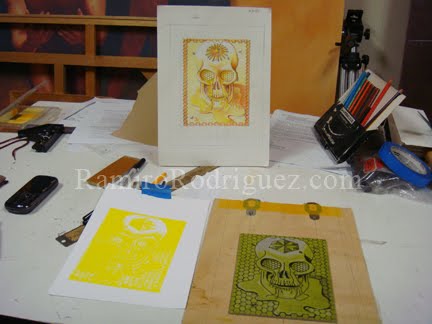
My paper is entitled “Caritas: The Immigrant in the Word” which is the title I gave to the latest series of relief prints. The print series combines passages from books of the Bible with images of contemporary immigrant issues such as rights abuses due to legislation.
This 6 print series began with a print I created for the Consejo Grafico’s portfolio entitled “Borrando la Raya/Erasing the Line”. The portfolio consisted of images dealing with immigration issues. My contribution was a 9 x 13” color linoleum block print entitled “Fallecio el SeƱor Urbano Ramirez” (Mr. Urbano Ramirez died).
The idea for the image came about after I heard Mr. Baldemar Velazquez, President of Farm Labor Organizing Committee (FLOC) speak in 2009 at an award ceremony honoring my father, Maximino Rodriguez, with the Cesar Chavez Tri-Community Award. Mr. Velazquez told the shocking but now all to common story of farmworker, Urbano Ramirez Miranda, who died in a field in North Carolina and was not found until 10 days later. Undocumented = cheap & expendable labor.
Within his talk Mr. Velazquez, an ordained chaplain, spoke of his search through the bible for passages that deal with the treatment of the alien/immigrant among other people. He found three passages that spoke to this subject - Exodus 22:21, Numbers 15:15, and the one of which I chose to use as a footer to the image. The passage is from Leviticus 19:34 “The alien living with you must be treated as one of your native born.” The print and quotes inspired me to create prints marrying the remaining passages with powerful images to make an impact on those that profess charity through their religion yet ignore the written word’s suggestions. I have expanded on the three passages with a few more for a total of six passages and images.

Wednesday, January 4, 2012

Exchange

My 1993 oil painting "Exchange" is gracing the cover of Austin musician, Adrian Benavides's new album "Same Time Next Life" set for release in June 2012. I'm pretty psyched to be included in the mix with these quality musicians.

Friday, December 16, 2011

Collaborative Printing

I’ve spent a week and a half collaborating with Joe Segura’s print class to create a new four color lithograph. I used one of the images I’ve been working up for a linoleum print version for the “Immigrant in the Word” series. The look I was going for was to mimic the old “Dick and Jane” reader style illustrations and primary color scheme. I had to work fast to draw up the four plates so the class could print and finish before the end of the semester. I’m pretty happy with the results. I’m not sure if I will include the color version with the series yet.

Wednesday, October 26, 2011

Recycling the Dead

I'll be giving a talk at Harold Washington College in Chicago, IL on November 3rd entitled "Recycling the Dead". Public is welcome.

Friday, September 2, 2011

Navigating the Currents

I volunteered to make a print for Inkteraction’s Navigating the Currents: 100 Inkteraction Reactions portfolio. My idea is pretty simple: a printmaker carrying a heavy roller through a binary marsh of 1s and 0s.
This print's requirements were for a smaller 5x7” sheet of paper so the image is pretty small. I chose to further explore color reduction relief printing with my snazzy new registration system. This time I went for a cooler palette than the previous two prints.
(1st & 2nd color layers)
I don't know if it is the changes in humidity or my new block prep that have affected ink layering in a positive manner. In prepping to ink up this block I scraped down the linoleum with the side of a razor. The “La Vida Dulce II” print had some inconsistent ink layers due to what I think was the factory texture of the lino block. Each successive layer of ink picked up on the texture of the layer below and compounded the “orange peel” texture where I had intended flat areas. Of course I rolled with it and used the texture to some advantage but I wanted to avoid this in the future. I believe the shaving/planing of the block prior to inking led to a more even and flat layer of ink. Four layers of blue were laid down to create the print. I debated adding a finishing black line layer. In the end I like the all blue palette.

Wednesday, August 24, 2011

La Vida Dulce take 2


I ordered a new registration system and decided to take another stab at the reduction print at the correct size. I restructured the drawing a bit from the first smaller print.


First color proof, second color block and proof:


The over lay of second color on first:


The third color proof, third color block and third color overlay:


The reduced fourth color block and printed overlay:


The fourth color overlay, fifth color block (now greatly reduced) and the final 5th color overlay:


Finished prints hung to dry:


For comparison, La Vida Dulce I (3 colors) and La Vida Dulce II (five colors).